Diagonal elements in visual communication are attention-grabbing. They look messy. In the case of text, the diagonal orientation makes it slower to read. Why is it, then, that many graphing tools default to diagonal labels when the x-axis becomes crowded? Or perhaps a better question: what can we do instead?
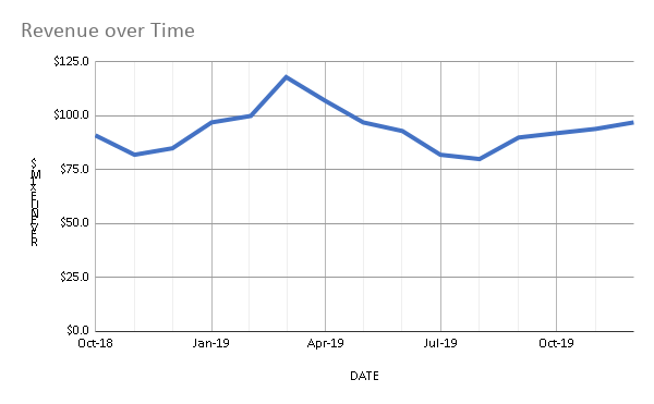
Only mention every 3th month, people are smart enough to fill in the rest, especially when adding some gridlines . Simple but elegant.