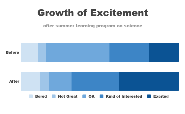
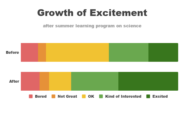
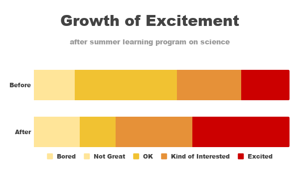
A frequent source of clutter in data visualization comes from unnecessary graph elements: borders, gridlines, data markers, and the like. These can make our visuals appear overly complicated and increase the work our audience has to undertake in order to understand what they are viewing. As we eliminate the things that don’t need to be there, our data stands out more. Let’s take a closer look at the benefit that decluttering can have on our data visualizations.
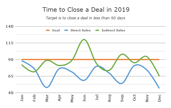
I’ve tried to find a solution to show lower is better without using words, unfortunately this makes a less appealing chart. Ended up with a clean smooth line chart. Maybe it could be improved by removing the legend and adding labels to the lines, only could not figure out where to put them so keep the legend.
The labels in the original are not adding much to the overall result, most important is the distance to the goal. Also removed the year from the months on the x-axis and added it to the title.