Soliciting feedback and iterating are incredibly important parts of the process for evolving our data communication skills. Getting good at giving feedback can also help sharpen your thinking in ways that ultimately improve your own work. As even more benefits, giving feedback in a constructive manner can not only have positive impact on the work of those to whom you give feedback, but also when it comes to effectively framing the feedback you’d like from others.
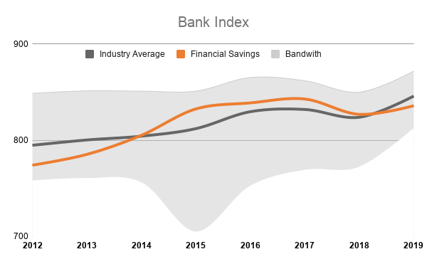
Thanks for preparing the 2019 Bank Index Graph, think you did a great job on collecting the data and making the first version of this graph. From the data it looks like we did not very well last year, we cannot hide this fact but we must make sure we present those figures in such manner it will not make things worse.
To be able to draft a decent picture it would be good to keep your audience and message in mind, could you please share with us who the intended audience is and what message you would like to convey? Is there a clear reason for the drop of our index in 2019? maybe we should explain this in a short guiding text.
Some initial feedback on your chart;
- Showing all banks as a separate category can be a bit overwhelming and will probably distract from the important data. Maybe it is an idea to display our index, the industry average and combine it with a min/max or bandwidth?
- Using an x/y scatter for a time based chart is not always the best solution, It doesn’t make it easy to compare one year with another. Maybe it is better to use a simple line chart.
- Please be aware of our corporate branding, for the elements representing ‘Financial Saving’ you should use the ‘Financial Saving – Close to Dark Orange’ for the supporting elements I would like to advise you to use a neutral color(grey or from the Pallet in our Corporate Communication Guidelines(CCG). By sticking to the CCG as much as possible your message will be consistent with other FS communication and will be better recognizable.
Hope this helps to improve your Graph, if you have any questions, please feel free to contact me.
Regards,
Conrad
PS. I’ve attached my try on visualizing this data, please feel free to build on that.