First, employ color sparingly to direct your audience’s attention to where you want them to look. Second, use words to tell your audience why you want them to focus there. This can be in your spoken narrative, written directly on the graph or slide, or a combination. These two simple things can go a long way in overcoming other issues. Perhaps it’s not the perfect graph type or there is some clutter present. But if you can indicate to your audience where they should look and why, this can still be a successful communication scenario.
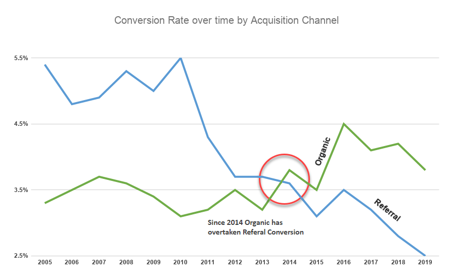
In general the simpler the graph the understandable it is. I’ve removed the total (doesn’t add much if you want to highlight the event where Organic becomes bigger than Referral. Added a nice red circle to focus on that point. Put the labels in the Graph (in the rising and faling direction)