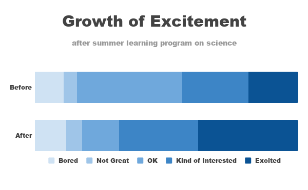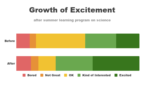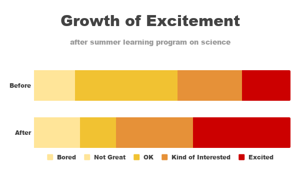
You’ve just completed a summer pilot learning program on science aimed at improving perceptions of the field among young elementary children. You conducted a survey going into the program and at the end of it, and want to use this data as evidence of the success of the pilot program in your request for future funding.
It is so tempting to use a pie chart when you have a limited set of data, the risk of faling back on the trusty old pie is the limited options to compare. For this challenge I’m falling back on an old favorite, the 100% bar chart. with two 100% bar charts it is easy to see movement over the whole range (especially when like in this case, using a scalable but not so exact set of categories.
Only not completely sure on the colors, I’m more used to a risk based approach in which the lack of excitement will be red and the more engaged/excited group will get the less exciting green. Also tried the les to more exciting yellow to red, this also didn’t work out as good as hoped. At the end I decided to just pick a color and do a scale from light to dark (probably the way I would do it when doing it in an environment where colors are limited by some sort of guideline.