Words can help make data make sense. That said—which words we choose to use can vary a ton, depending on exactly who we are communicating to. In some cases, quick and dirty output directly from our tool might be totally fine, whereas other situations will call for an intentionally designed graph and widely accessible language. Let’s look at a specific scenario and explore the use of words given varying conditions.
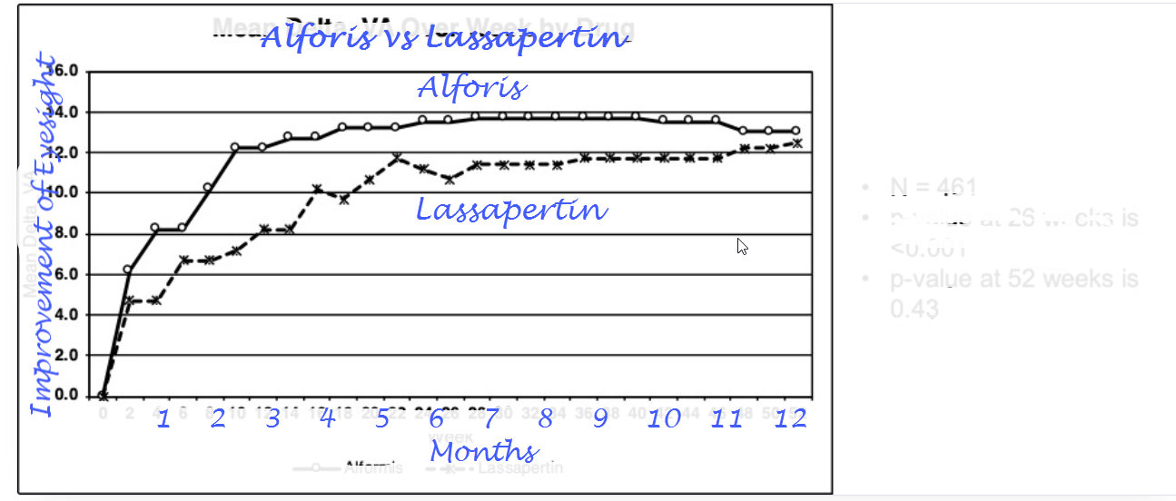
When communication to the general public, a more generalized and simplified chart could be beneficial. when starting from scratch I would use Brand colors (at least for our winning brang) in the chart. Smooth it out a bit, maybe cheat by stopping at 10 months (the difference at 52 wk is minimal)
For now I have removed all detailed information which just distracts, added a clear title. Removing the legenda and put the product names in the chart will make it more visible which line is which. Counting in weeks is not something lot of people are used to, therefore changed the X-axis to months. Changed the Title of the Y axis to a more understandable metric (not completely factual but it conveys the message)